How to Design a Modern Man Cave That Doesn’t Look Like a Pub
Share

We’ve all seen the man cave that tries too hard — bar stools, a giant neon sign, and a cheap plastic footy clock. But designing a modern man cave doesn’t mean ditching personality — it means doing it with taste. Here’s how.

Start with a clean base
Matte finishes, darker walls, timber or polished concrete floors set the tone. Avoid shiny plastics and gimmicks.
Build around one great piece
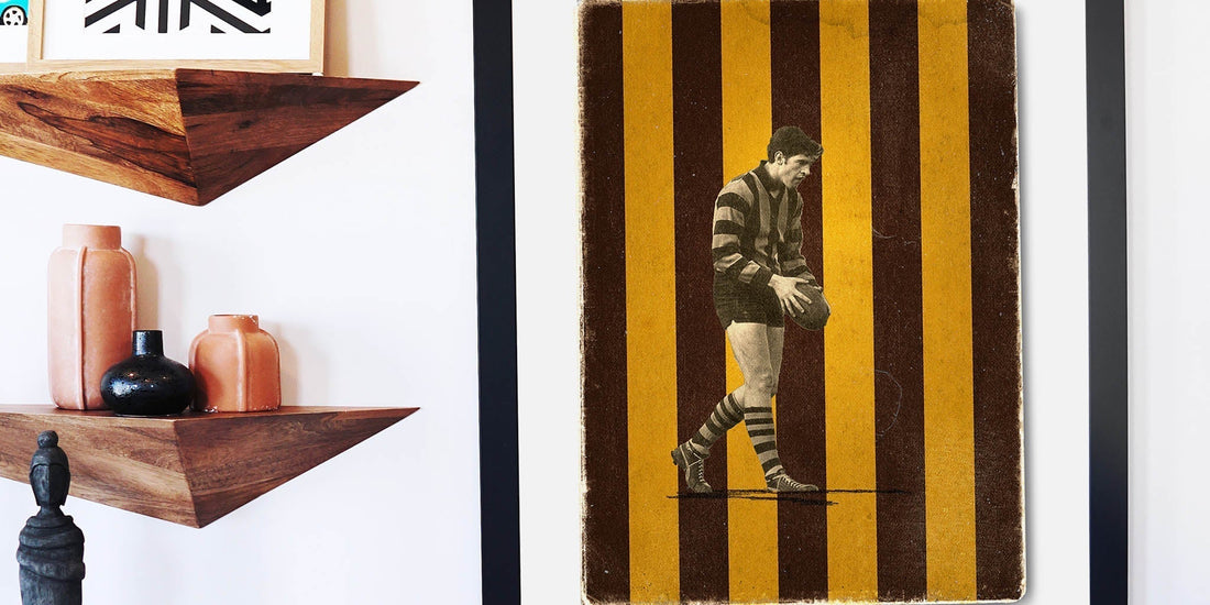
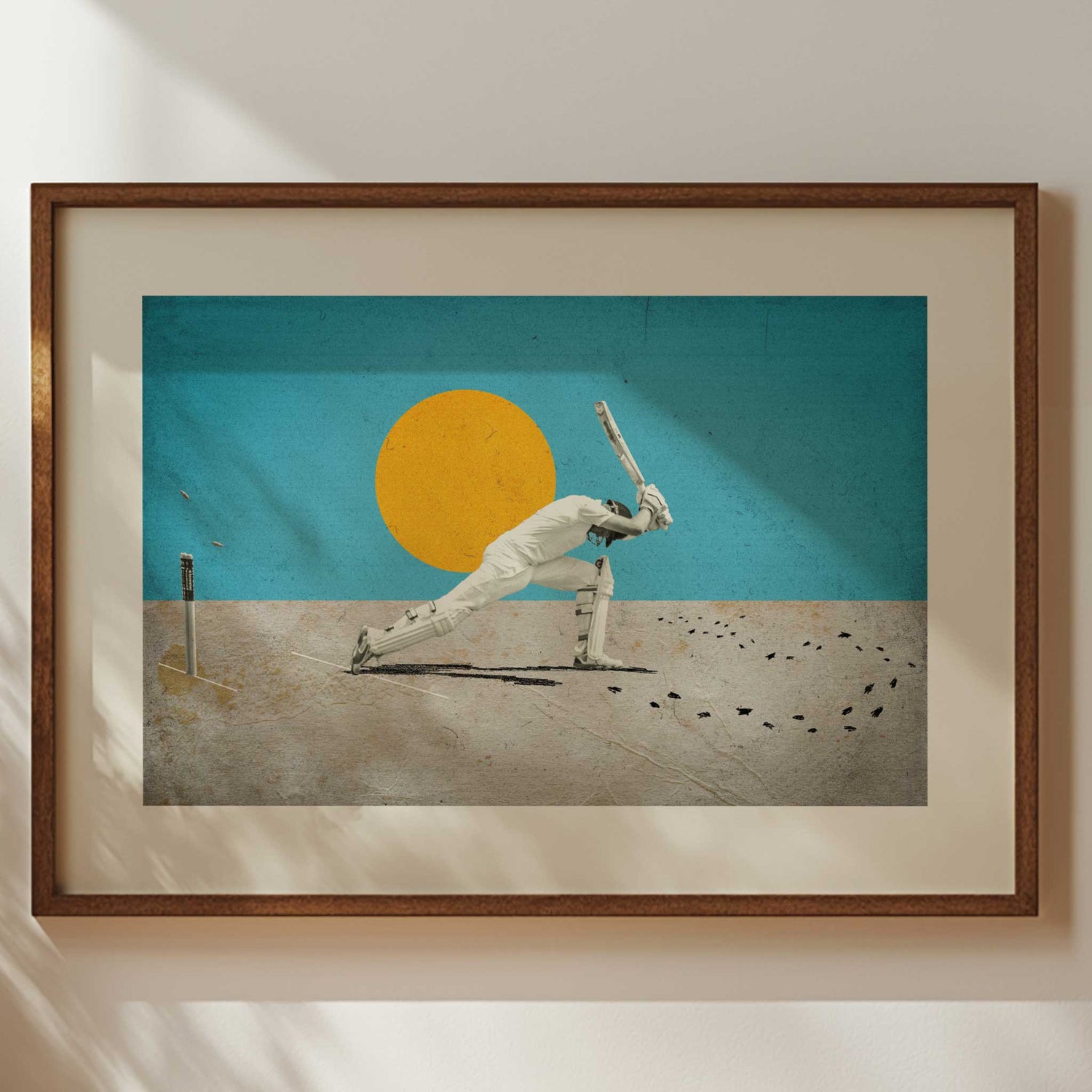
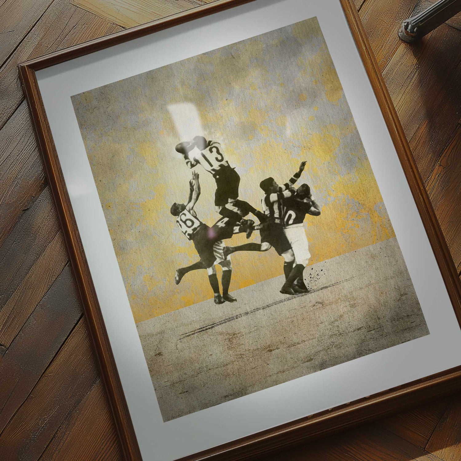
One striking piece of sports wall art — a limited edition cricket print or a custom AFL collage — can centre the whole space.

Zone your space
Define a reading corner, a game station, and a display wall. Good design = clear intention.
Use lighting like a designer, not a stadium
Warm spotlights or gallery strips highlight your art and memorabilia. Fluoro tubes make everything look cheap.
Add texture and layers
Framed prints, vintage scarves, leather armchairs — these nods to sporting culture make your man cave feel personal, not pubby.
Common Pitfalls to Avoid
- Going full theme: If your man cave feels like a themed restaurant, pull back. Aim for subtle nods, not screaming motifs.
- Bad lighting: Fluorescents or mismatched bulbs cheapen the look instantly. Invest in consistent, warm lighting.
- Overcrowding: Leave some wall space blank. Clutter kills atmosphere.

Real-Life Example: Modern Done Right
Take Craig from Brisbane — a long-time Hathorn supporter who turned his guest room into a calm, dark-toned retreat. He started with two Fisher Classics prints framed, and finished it with a low-slung grey sofa and a whisky cabinet. "Everyone assumes it cost me a fortune — but really, I just edited ruthlessly and chose the right centrepiece."
Skip the Bunnings bulk-buy decor. Start with art. Build from there.


