
After many requests for old Carlton artworks, FC decided to experiment with some new techniques and styles to examine the force of Carlton FC through the late 1970's to the 1990's.
At our market stalls we have been overwhelmingly asked if we have any artworks of Carlton players. This request outweighs any other team by a ratio of 5:1. There is a genuine love for that period from Carlton fans who miss the old days when they were a regular fixture in the finals and a force to be reckoned with.
Finally we got around to creating a series of works around this period. We were keen to display more than a bunch of pretty images with great players featured. We looked to explore what made The Blue Baggers so intimidating, brash and full of braggadocio through this time and why the modern incantations of this club have failed to ignite the passions of lifelong fans.
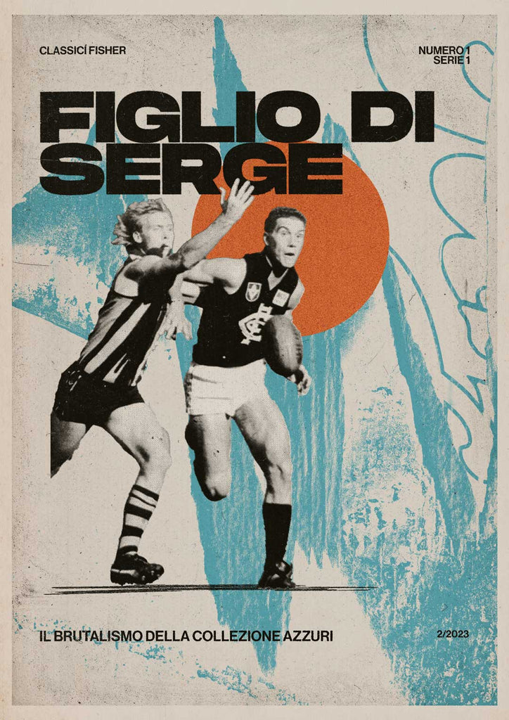
Brutalismo
'Ruthless' is a word that gets thrown around as a cure for clubs that are not going very well these days. When looking at Carlton and their flags from the 70's to the 90's 'Brutal' was a term that came to mind.
The enormous logo that sat below broad shoulders and wild, dark moustaches and manes. The man to man stouches on the field. They looked, played and sounded tough.
Even now AFL fans snarl the name of the club 'CAAAAAARLTN!' referencing the drawl of dart-chomping President and King of Humility, John Elliot.
The club itself was self aware enough to know this was their brand. Look no further than their club mascot;

The nicknames were incredible, a far cry from the friendly, familiar, arm-in-arm monkiers of today; 'The Dominator' 'The Cranium' 'The Flying Doormat' 'Helmet' and ''Diesel'. Clad in dark blue, these guys were an order of assassins that were going to mow their way to finals and flags.
Carlton's brutality was in the suspensions of David Rhys-Jones, a tribunal regular and hard nut. He was an outlier in a period where every team had an enforcer that was picked to do quite a bit of enforcing.
But Carlton seemed to have a team of enforcers. Not to suggest that they were grubs by any stretch, the whole club just exuded toughness.
Carlton felt like an immoveable, concrete building; permanent, dominant, unforgiving and unrepentant.
To us Carlton was not only ruthless; it was Brutal.
Italiano
Carlton the suburb was also distinctly migrant influenced. These artworks are in Italian as a nod to the (broader) migrant influence of the suburb and subsequently the club.
It's also a nod to the sophistication of Carlton and it's place in the dawning of modern Australia. Without getting to deep into a sociological study, Carlton truly was the modern Australian Sporting Club from the 70's to the 90's.
The hugely successful club was a complex melting pot of cultures and socio-economic backgrounds set in a suburb at the forefront of aussie multiculturalism.
That said, the players nicknames just sounded way more amusing in Italian.
Process
This was a personal project for our artists to explore a few artistic ideas and some technical skills. This involved a bit of research and field trips to Princes Park, and Museo Italiano.
There's an in depth exploration of the creative process in our workshop blog if you'd like to go deep on the way we put this together. We list the design influences, techniques, texture process and references we looked at in creating these works.
For more on the creative process around this series you can take a look at our workshop blog.


